What’s the best way to relatably communicate the carbon footprint of food products on their packaging?
What do a running man, a banana, and a footprint all have in common?
No, it’s not the start of a bad joke, but each of these items has been used at one point or another to communicate risk to the public.
The ‘Banana Equivalent Dose’ was developed in the mid-90s as a way for scientists to explain radiation levels to a population concerned about nuclear exposure. Bananas contain potassium, a naturally radioactive substance, albeit in very small amounts – approximately 0.1 microsieverts per fruit.
This fact led to the evolution of a banana rating scale to help explain nuclear exposure in units that were more easily understandable by you and me – going for a dental X-ray? That’s 50 bananas’ worth of radiation. Flying from New York to London? 400 bananas. Heading to your scheduled mammogram? 20,000 bananas.
What about living within 50 miles of a nuclear power plant? Surprisingly, that’s the equivalent radiation dose to consuming just one extra banana per year.
Making climate risks relatable

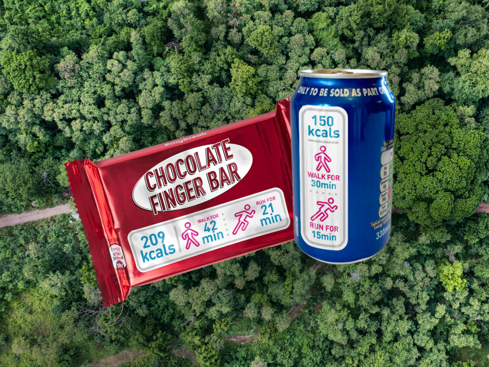
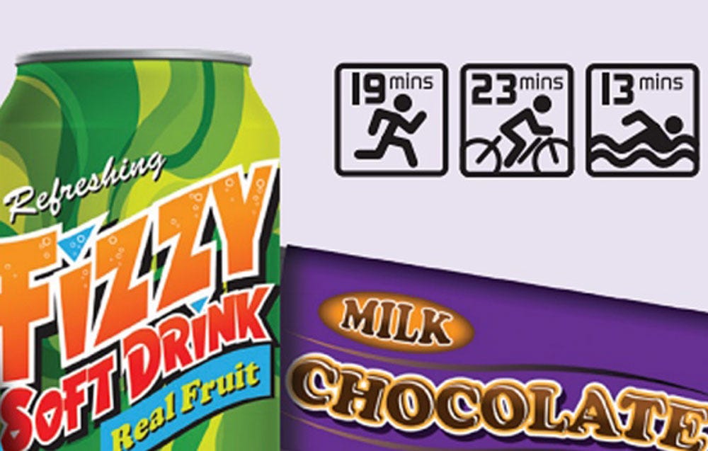
This idea of communicating risk using intuitive units rather than raw statistics has latterly also been trialled by the food industry. For example, brands have experimented with adding ‘exercise equivalent’ labels to products explaining how much time you’d need to spend running or walking to burn off the snack that you just ate. This time, one banana is equivalent to a 20-minute walk. A bar of chocolate, on the other hand, will double your walk length, while a large pizza will cost you an 80-minute hike.
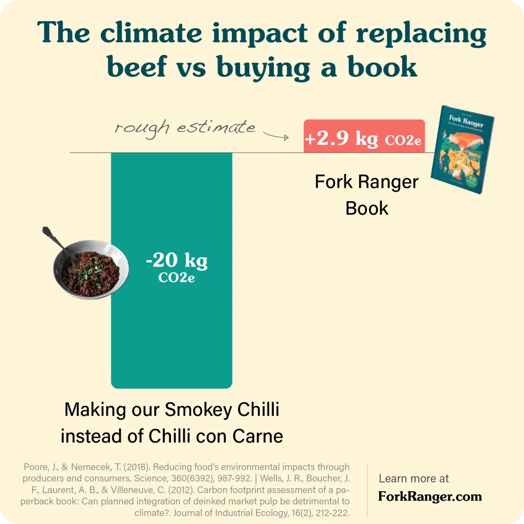
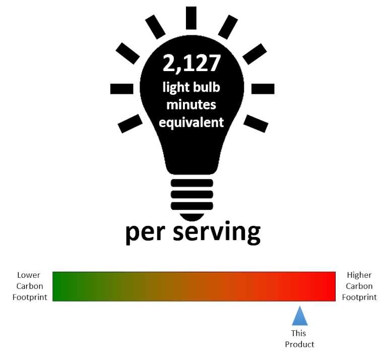
And a similar approach has also been explored to explain the environmental risks associated with our diets. Here, research has looked into the benefits of communicating carbon emissions as a traffic light grading system, total values (an approach chosen by brands such as Oatly or Quorn), or simply designating items as ‘sustainable’ or ‘plant-based’.
A little footprint icon or green leaf is often used on packaging and menus, while more recent research has looked into coloured food emojis as a more tangible alternative.
Equivalently effective labeling
The intention here is to communicate an otherwise complicated idea in more relatable terms, enabling consumers to make more mindful food choices. But, the big question is: do any of these approaches actually work?
When it comes to making healthier food choices, the research suggests that exercise equivalent labelling is indeed better than no labelling to help us cut the calories, but shows little benefit above standard numeric kcal information. For carbon footprints, fewer studies have looked into equivalent labels, although adding carbon information has been found to motivate more sustainable food choices in general. There is, however, no compelling evidence that one label format – i.e. colours, icons or numbers – is superior to any other. It’s all equivalent, it seems.
Clouds, coal or car trips?

This leads us to the question: what is the most intuitive unit of carbon to communicate to the public? Should we be sticking with the numbers, or instead talking in terms of the size of a smoke cloud issuing from a factory chimney, the number of chunks of coal or even cans of carbonated drink that we have avoided when switching to more sustainable snacks?
Perhaps not, although using equivalent values that more naturally fit our own ‘saving the planet’ mental schemas may help. For example, talking in terms of the activities that we are already doing to cut our personal environmental footprints, such as making fewer car trips or fewer laundry loads, recycling bottles or cans, or avoiding plastic bags.
Some quick calculations (with the help of ChatGPT) suggest that switching out one average burger meal may be equivalent to avoiding 3 typical car trips or 2 loads of laundry, recycling 10 aluminium cans, or foregoing 155 plastic bags. While these figures require more accurate calculation, they do help put our dietary choices into the context of our daily efforts to live more sustainably.
Climate costs in micro-lives
Previous health research can also inspire other ideas to enhance the impact of carbon labels. Personalising risk estimates or visualising consequences (as in the case of cigarette pack images) have been used with some success to change risky health behaviours.
Other studies have tried to make risk more concrete and salient by communicating the minutes of your life that you will lose as a direct consequence of small, but cumulative bad habits. Smoking one cigarette will cost you 20 minutes of life, for example, while switching out 10% of your daily calories from beef to plant-based foods will save you 48 minutes.
This concept of micro impacts might similarly prove valuable to describe the environmental impact of different items in more consequential terms. Relevant micro units here might be something like ‘days of extra AC you’ll need to pay for to combat extreme heat’ or ‘days that you’ll spend breathing in highly polluted air’ per steak consumed.
The promises and pitfalls of omni-labels

Environmental experts will add further critiques of carbon labels, with debates ongoing regarding which impacts we should talk about (e.g. carbon, methane, water, biodiversity etc), the accuracy of calculations, and how to describe trade-offs between these impacts and other factors relevant to our dietary decision-making.
As the ultra-processed food debate has revealed, not all sustainable food choices are healthy, while not all low-carbon products are sustainable on all the environmental impact metrics we may care about.
It is here that the concept of ‘omni’ labels has been floated, as a way to communicate multiple health and environmental impacts wrapped into a single label or score. It remains to be seen whether cleverly designed versions of these labels will help consumers to make more value-aligned food choices, or whether they will just wash out the effect of a single compelling impact metric or lead to more overall confusion about what to eat.
While describing the environmental impact of our food is a valuable way for businesses to engage consumers and support better choices, carbon ‘literacy’ amongst the public remains low, and for those consumers who value convenience, taste or price to a greater extent than sustainability, omni-labels may be a case of just too much information. For these shoppers, a solid carbon equivalent label, in whatever format, might prove effective at landing the intended point of ‘eat this, not that’.
And if you’re thinking that reviving that banana benchmark might be a good way to go here, you may like to know you can eat almost 17 fruits to match the carbon footprint of one single beef burger.
The post The Banana Benchmark: Can ‘Equivalency’ Carbon Labels Help Us Make Better Food Choices? appeared first on Green Queen.
This post was originally published on Green Queen.